
By the Vertexweb team. Last reviewed 4 October 2026.
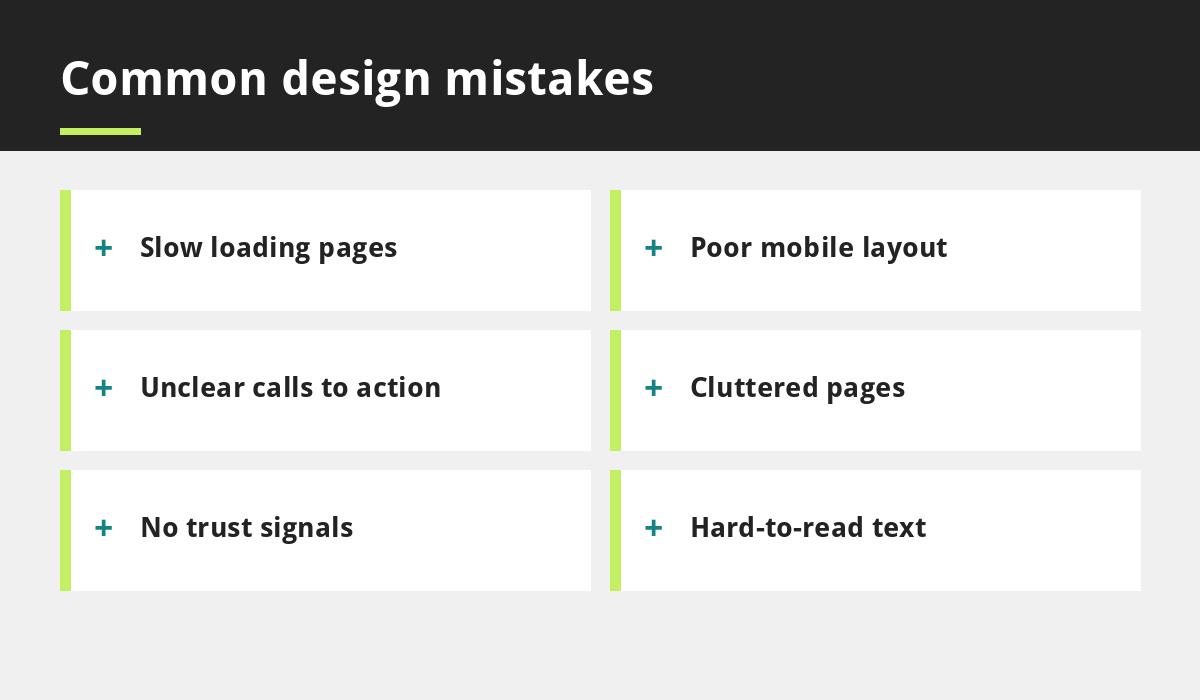
Most websites lose customers for a handful of fixable reasons: slow pages, a poor mobile layout, unclear next steps, cluttered design and missing trust signals. The good news is that you rarely need a full redesign to improve results. Small, targeted fixes can make a site easier to use and more likely to produce calls, bookings and enquiries.
This guide covers the five biggest website design mistakes we see on small business sites, explains why each one hurts and shows how to fix it. It also includes a quick self-audit you can run in about fifteen minutes.
Key takeaways
- Speed, mobile layout, clear actions, simple design and trust signals matter more than visual flair.
- Fix problems in order of impact: usually mobile and speed first.
- Test with real people on real phones.
- You do not need a new website to fix most of these mistakes.
- Use a checklist before every launch or major update.
Mistake 1: Slow loading pages
Visitors rarely wait for a slow page, especially on mobile data. Common causes are oversized images, heavy sliders and videos, too many plugins and weak hosting. Google’s Core Web Vitals give targets for loading, responsiveness and stability, such as a Largest Contentful Paint of 2.5 seconds or better, an Interaction to Next Paint of 200 milliseconds or better and a Cumulative Layout Shift of 0.1 or lower, measured for most real visitors.
The fix: compress images, remove unused plugins and features, choose good hosting and test regularly. Our step-by-step guide to speeding up your small business website shows how.
Mistake 2: A poor mobile experience
Many sites are designed on a computer and only squeezed onto a phone afterwards. Typical problems include tiny text, buttons too close together, menus that are hard to open and tables or images that run off the screen. Google also primarily uses the mobile version of a page for indexing, so a weak mobile site can affect visibility too.
The fix: design for the smallest screen first, with large tap targets and short sections. Read why your business needs a mobile-first website for a full approach.
Mistake 3: Unclear calls to action
If a visitor has to hunt for how to contact you or book, many will give up. Pages that end without a next step, or that offer five competing buttons, create hesitation.
The fix: decide the one main action for each page, such as Call now, Book a table or Request a quote, and make it visible at the top and again at the end. Use clear button text that describes what happens next.
Mistake 4: Cluttered layouts
Too many fonts, colours, banners and competing messages make pages tiring to read. Busy layouts also hide the information people came for.
The fix: use plenty of white space, a limited colour palette, one or two fonts and a clear heading structure. Put the most important information first, and remove anything that does not help the visitor decide. If you are building a consistent look, our post on building a strong brand identity can help.
Mistake 5: No trust signals
New visitors need reassurance that you are real and reliable. Missing contact details, no reviews, no examples of your work and no information about who you are all raise doubts.
The fix: show your address, phone number and opening hours, genuine reviews, photos of real work, accreditations where relevant and a short about page. Display reviews fairly rather than only the best ones, as UK rules on misleading reviews now apply. See our reviews guide for details.
Other mistakes worth checking
- Hard-to-read text: low contrast or tiny fonts exclude many visitors.
- Stock photos: generic images make a business feel anonymous. Use real photos where you can.
- Confusing menus: keep main navigation to a handful of clear labels.
- Missing page titles and descriptions: pages that are not set up for search are harder to find.
- Forgetting to test forms: broken forms silently lose enquiries.
A fifteen-minute website self-audit
- Open your site on your phone and try to find your phone number within five seconds.
- Run your homepage through Google’s PageSpeed Insights.
- Click every menu item and button.
- Fill in your contact form and confirm it arrives.
- Read your homepage as a stranger. Is it clear what you do, where and how to contact you?
- Ask a friend to complete one task, such as booking, while you watch.
For a fuller review, use our small business website checklist.
How to prioritise your fixes
Do not try to fix everything at once. Rank problems by how much they affect visitors and how easy they are to solve. Broken forms, missing phone numbers and a slow or unusable mobile layout come first, because they stop customers acting. Next, improve the clarity of your main message and calls to action. Finally, refine visual details such as fonts, spacing and imagery. Fix one area, test it on a real phone and then move on. Small, measured improvements are easier to manage and show you what is working.
Accessibility basics worth getting right
Good design works for everyone, including people with low vision, motor difficulties or older devices. Check that text has strong contrast against its background, that headings follow a logical order, that images have descriptive alt text and that buttons have clear labels. Make sure the whole site can be used without a mouse. These steps help customers, and they usually make your pages clearer for search engines too.
Final thoughts
Website design mistakes are usually simple to spot and simple to fix once you look at your site through a customer’s eyes. Start with speed and mobile, make your next step obvious, simplify the layout and show proof that you are trustworthy. Then keep testing as your business changes.
If you would like a professional review, explore our web development services or get in touch.
Sources and further reading
Related reading
- Why Your Business Needs a Mobile-First Website
- How to Speed Up Your Small Business Website
- Small Business Website Checklist
- Affordable Website UK: Red Flags to Check Before You Pay
Launch offer for UK small businesses. Get a professional website for just £299 a year. Only the first 20 customers, for restaurants, small clinics and small businesses.