By the Vertexweb team. Last reviewed 4 October 2026.
A mobile-first website is designed for phones first and then adapted for larger screens, so the experience works well for the way most local customers browse. It also matters for search: Google primarily uses the mobile version of a page for indexing and ranking. If your mobile site is slow, cramped or missing content, you risk losing both visitors and visibility.
This guide explains what mobile-first means, why it matters for small businesses, the design principles that make a difference and how to test your own site.
Key takeaways
- Mobile-first design starts with the phone experience, then scales up.
- Google primarily uses the mobile version of your pages for indexing.
- Large buttons, readable text, fast images and simple navigation matter most.
- Click-to-call, maps and short forms turn mobile visitors into customers.
- Test on real phones, not just a resized browser window.
What does mobile-first mean?
The phrase has two related meanings. As a design approach, mobile-first means planning layouts, content and features for small screens first, then adding enhancements for tablets and desktops. As a search term, mobile-first indexing means Google primarily looks at the mobile version of your site to understand and rank it. Both point to the same lesson: your phone experience is not an extra.
Why it matters for small businesses
Local customers often search while out and about, comparing options, checking opening hours and looking for directions. They expect to tap a number, open a map or book in seconds. Check your own analytics to see what share of your visitors use mobile, as it varies by business, but for many local businesses it is the majority. A frustrating mobile site sends them to a competitor.
Mobile-first design principles
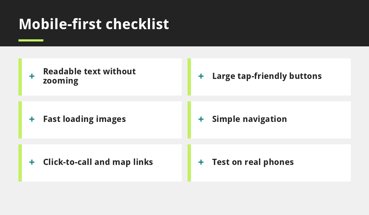
Readable text
Use a comfortable font size so visitors do not need to zoom, and strong contrast between text and background.
Large, spaced buttons
Fingers are bigger than cursors. Give buttons enough size and spacing to tap without error.
Simple navigation
Use a clear menu with a few key items, and keep your main action, such as call or book, in easy reach.
Short, scannable content
Use short paragraphs, clear headings and lists. Put the most important information first.
Fast-loading images
Compress and size images appropriately. See how to speed up your small business website.
Make actions effortless on mobile
- Add a tap-to-call button and make phone numbers clickable.
- Link addresses to a map app.
- Use short forms with only the fields you need.
- Offer simple booking, such as in our online booking guide.
- Place calls to action near the top and again after key content.
Keep mobile content complete
With mobile-first indexing, content hidden or removed on the mobile version may not be considered. Make sure your phone version contains the same important text, images and links as your desktop version, and that menus, tabs and accordions are accessible.
Mobile and local SEO
Mobile-friendliness supports local search because many searches happen on phones. Combine a good mobile site with a complete Google Business Profile and consistent details, as explained in how local SEO helps UK businesses and our Google Business Profile guide.
How to test your mobile site
- Open your site on at least one iPhone and one Android phone.
- Try to complete your main task, such as booking or calling, in under thirty seconds.
- Run PageSpeed Insights for mobile results.
- Check forms, menus and pop-ups.
- Rotate the screen and try slow data.
- Ask someone unfamiliar with your site to try it.
Add these steps to your launch checklist.
Common mobile mistakes
- Text too small or low contrast.
- Buttons too close together.
- Pop-ups that cover the whole screen.
- Large images that slow loading.
- Menus that are hard to open.
- Hidden or missing content on the mobile version.
More examples in five website design mistakes that cost you customers.
What mobile-first means for different businesses
Restaurants should put the menu, opening hours, map and booking button within one or two taps of the homepage. Clinics need a clear, calm layout with practitioner information, fees and a simple enquiry form that works on a small screen. Salons benefit from a quick price list, a gallery that loads fast and online booking. Trades should show a tap-to-call number at the top of every page and a short quote form. Our sector guides for restaurants, clinics, salons and tradespeople go deeper.
Pop-ups and cookie banners on small screens
A banner or pop-up that covers most of a phone screen can frustrate visitors and hide the content they came for. Keep consent banners compact, make the choices clear and avoid full-screen interruptions. Check how banners behave on a phone before launch, and read our GDPR and cookie compliance guide for the consent requirements themselves.
Common questions
Is a responsive website the same as mobile-first?
Not exactly. A responsive site adapts to screen size. Mobile-first is a design approach that begins with the phone experience, which usually produces better results on small screens.
Do I need a separate mobile website?
Usually no. A single responsive website that works well on all devices is simpler and generally recommended.
Does a mobile-friendly site help SEO?
It helps, because Google primarily uses the mobile version for indexing and because better experiences keep visitors engaged.
Final thoughts
A mobile-first website respects how your customers actually browse. Design for the phone, keep content complete, make actions easy and test on real devices. Do that and you improve both the experience and your chances of being found.
Need help? See our web development services or contact us.
Related reading
- How to Speed Up Your Small Business Website
- 5 Website Design Mistakes That Cost You Customers
- How Local SEO Helps UK Businesses
- Small Business Website Checklist
Launch offer for UK small businesses. Get a professional website for just £299 a year. Only the first 20 customers, for restaurants, small clinics and small businesses.